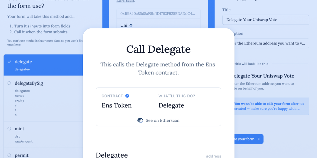
0.00Context
0.00Context
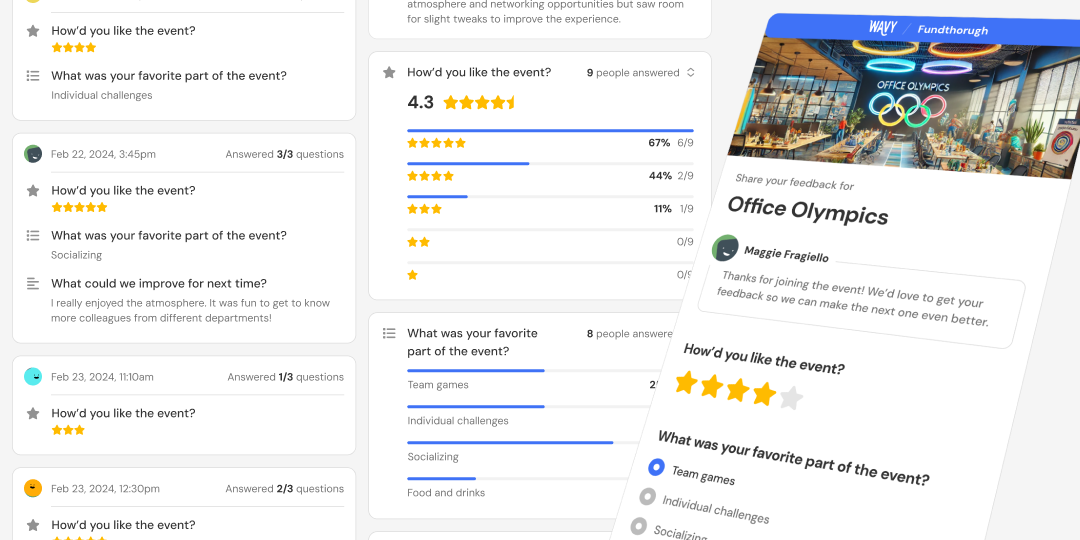
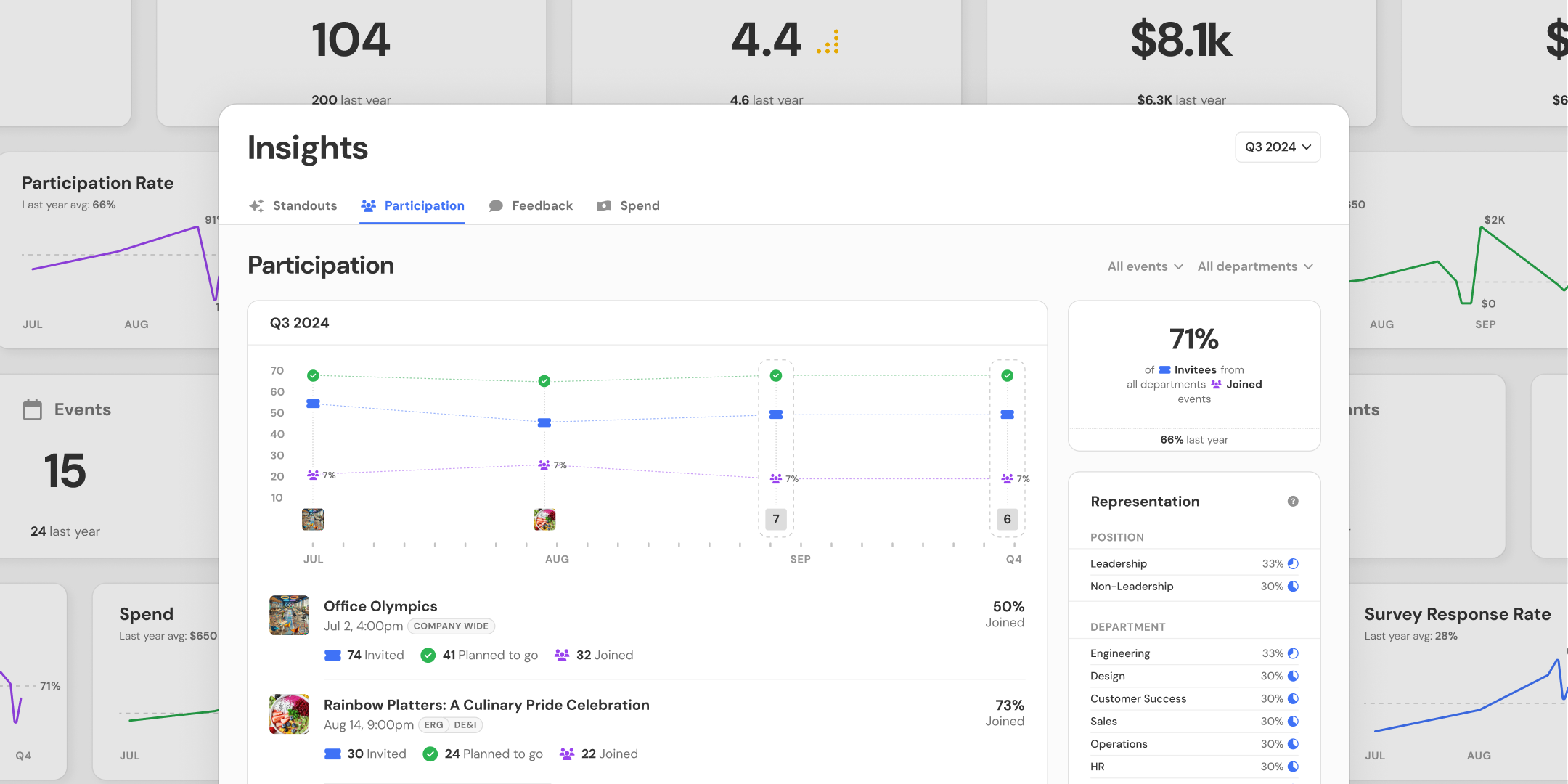
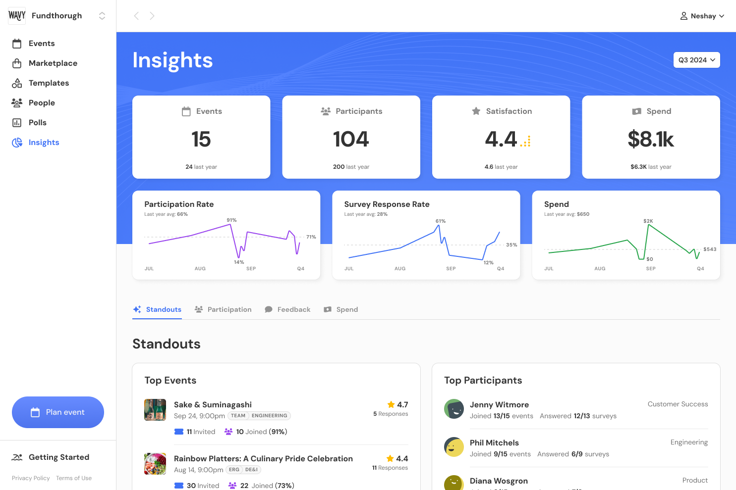
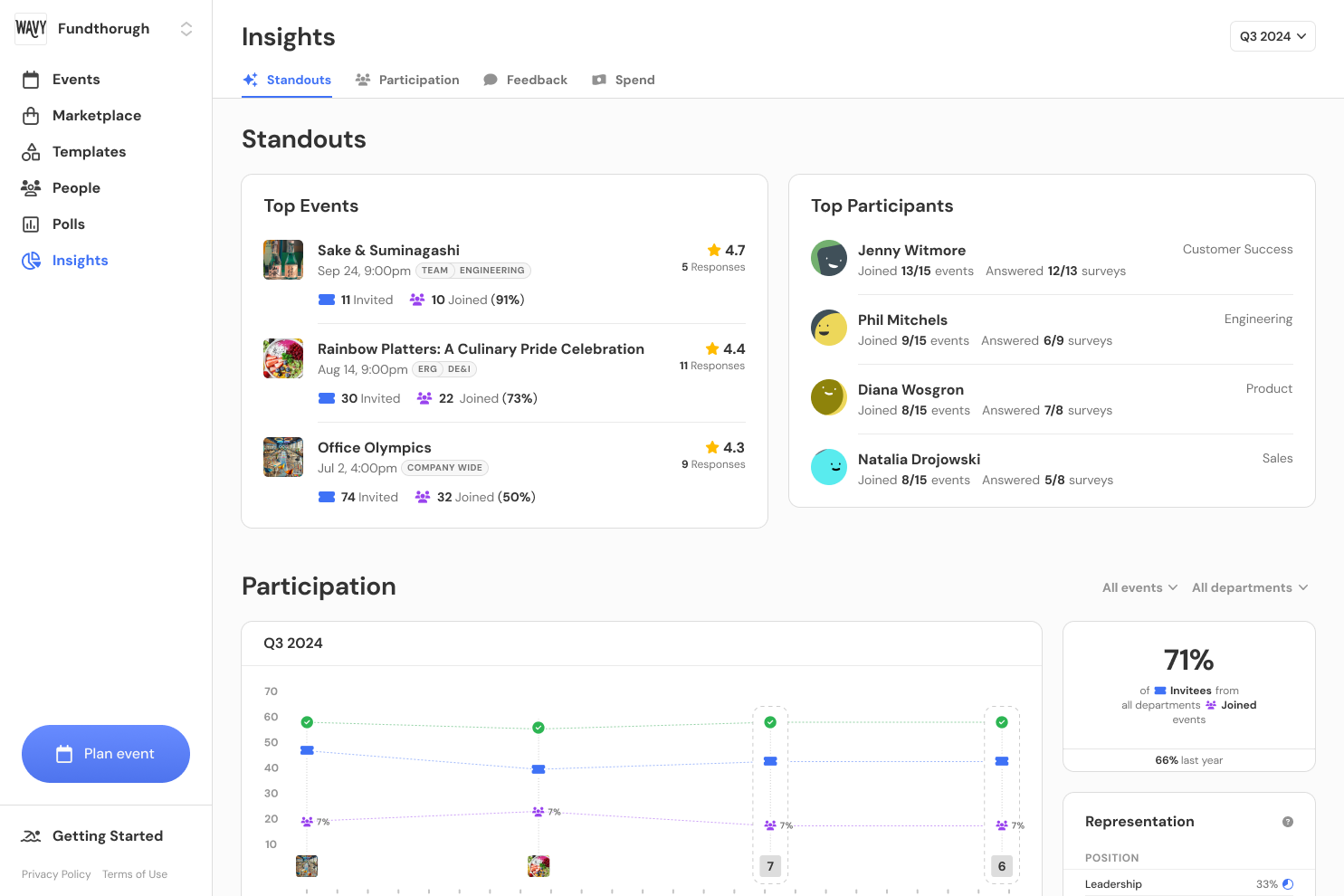
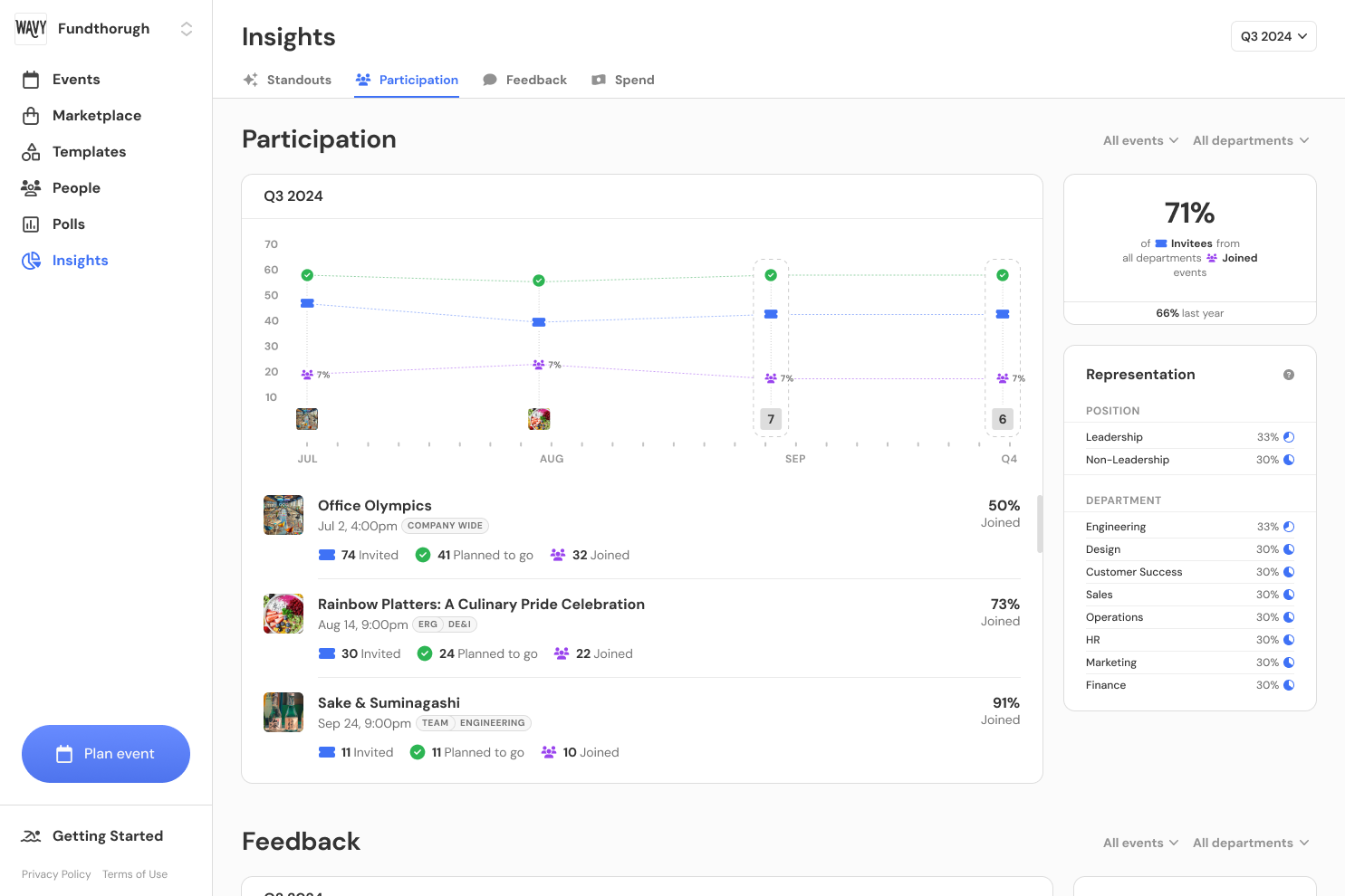
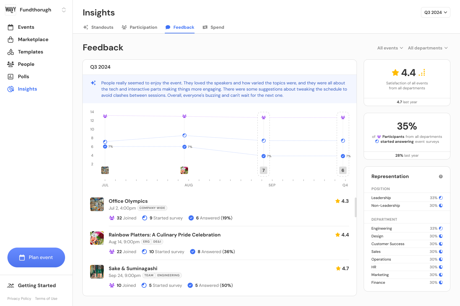
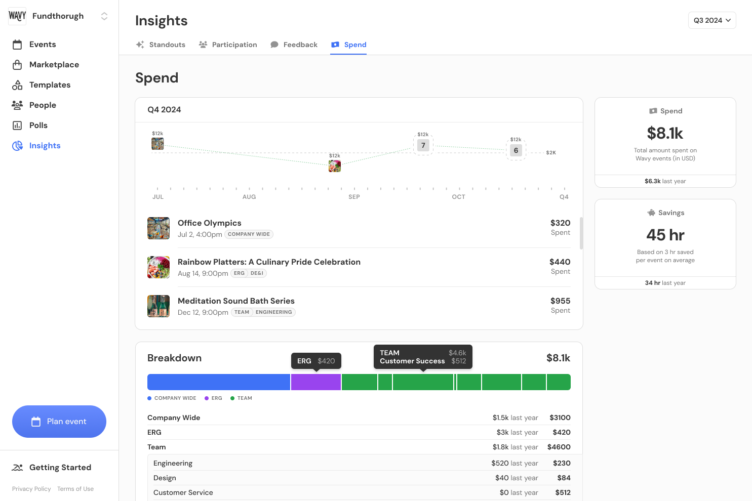
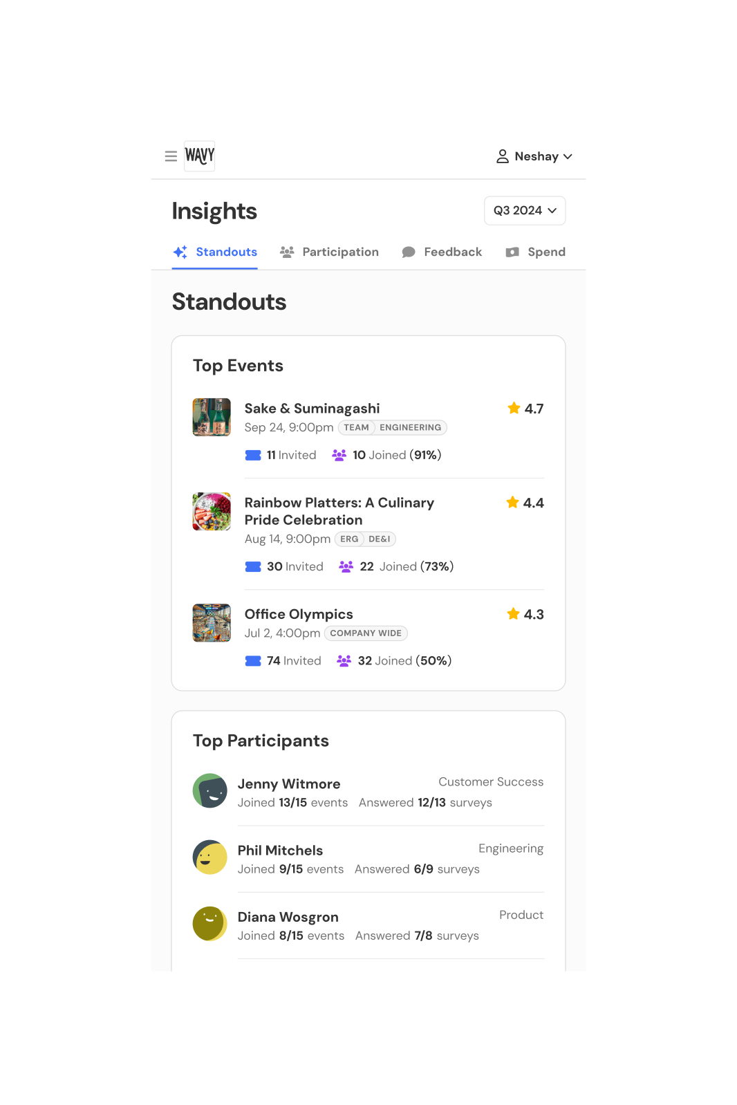
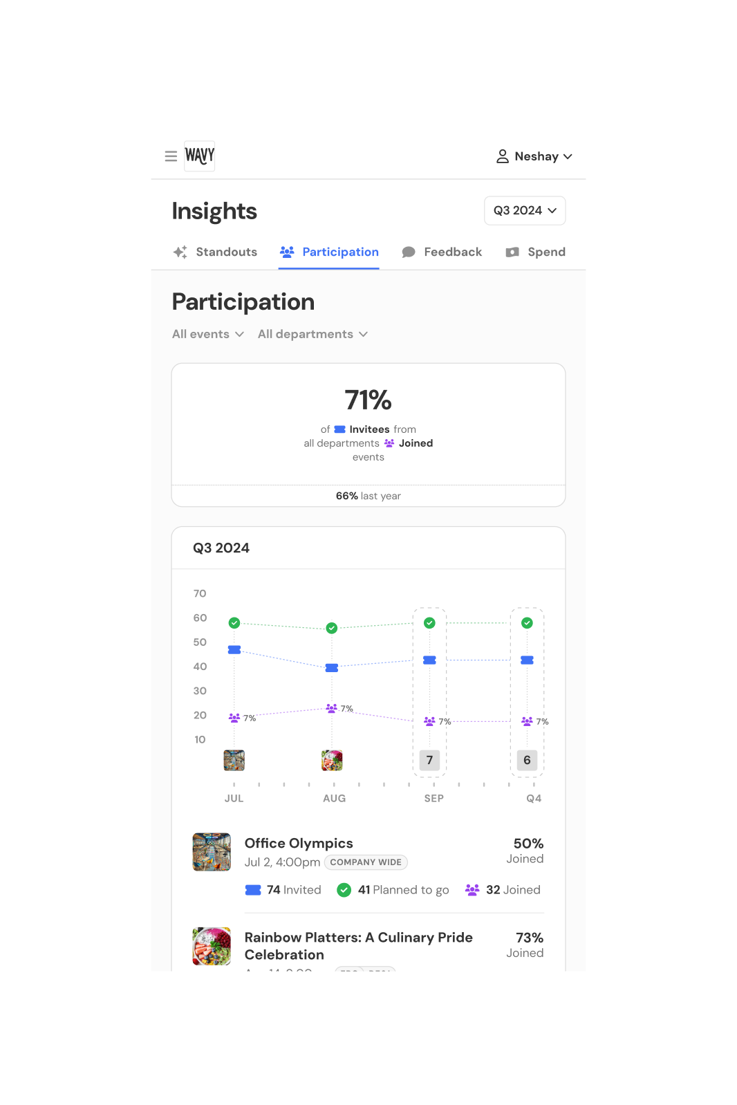
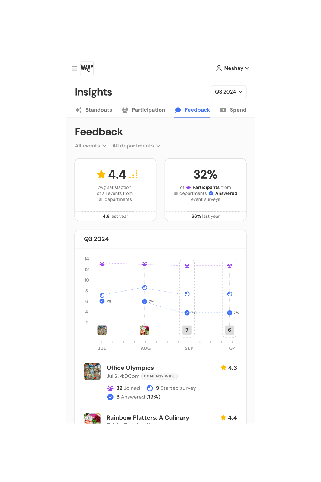
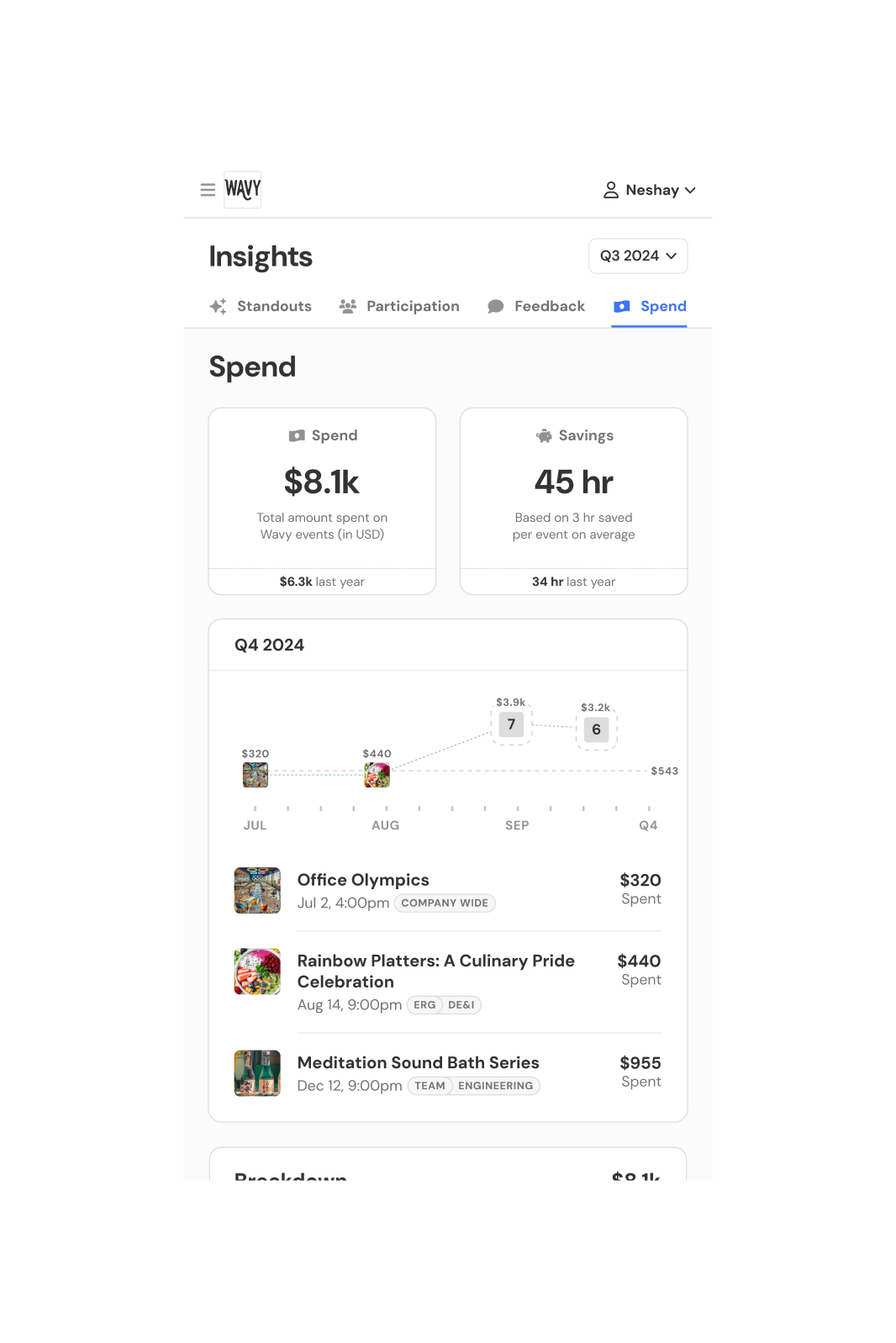
Wavy’s event analytics page started as a hackathon project but hardly anyone used it. Over time, customers wanted to see long-term trends to understand how their events were performing, but the sales team had to manually pull and average data for them. I redesigned the page to show stats over quarters, years, and all time, with graphs, department breakdowns, and year-over-year comparisons. For customers running hundreds of events, I added nested charts that let them zoom into specific months, weeks, or days.
1.00Walkthrough
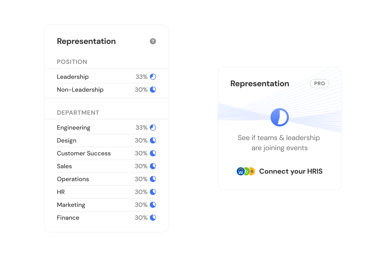
2.09Representation UI
3.00Grouping prototype